Designing a mobile application for an agile startup.
The Challenge:
To create an iOS application while accommodating a limited budget and timeframe. (Some elements of this project have not yet been added to the case study).
Goals and Objectives:
• Research the target audience and industry.
• Design an iOS application.
• Develop a consistent brand.
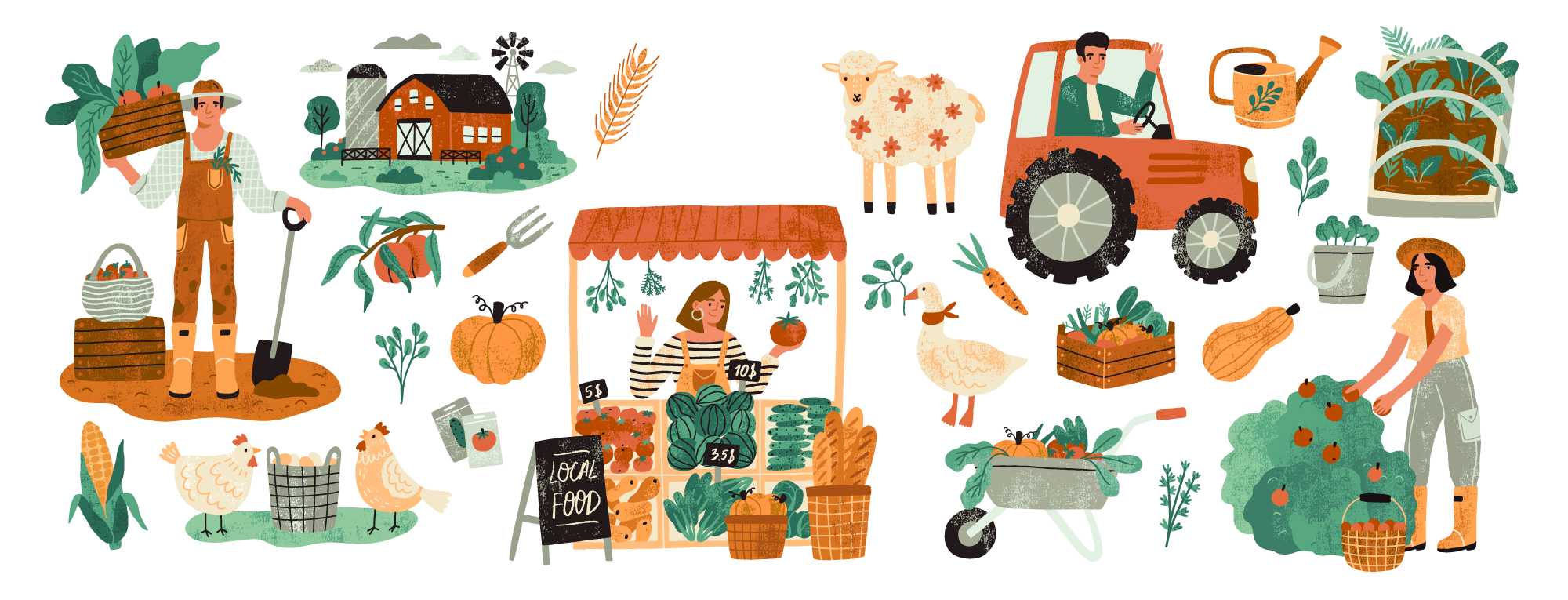
Carrots
Role:
Tools:
Timeline:
01. Empathize
To be able to create an appealing brand, website and iOS applications we had to first understand and identify the goals, needs, motivations, and frustrations those customers feel towards household food acquisition.
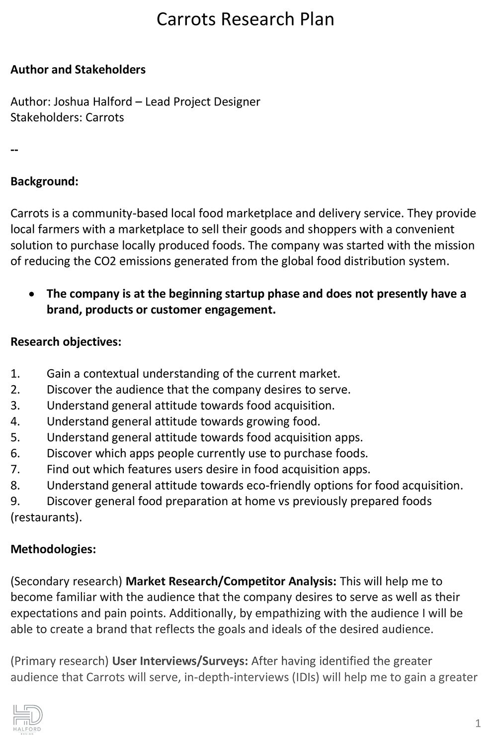
Research Plan.
We began by creating a research plan that would help keep me organized and on track for such a quick research phase. Our goals were to conduct one-on-one interviews, as a survey for current food shopping habits with a focus on food delivery apps. By performing interviews of current shopping habits, we could find insights and patterns on users’ decision making process to enhance the digital experience as well as identify pain points.
• Research Types: 1–1 Interviews, Contextual Inquiry
• Total Participants: 5 Total ( 5 Women)
• Age Groups: 26–65 year olds (Mixture of Millennials and Boomers)
Through the research, we were able to identify some needs, pain points, and motivations of these shoppers that were really helpful.
Interviews & Survey.
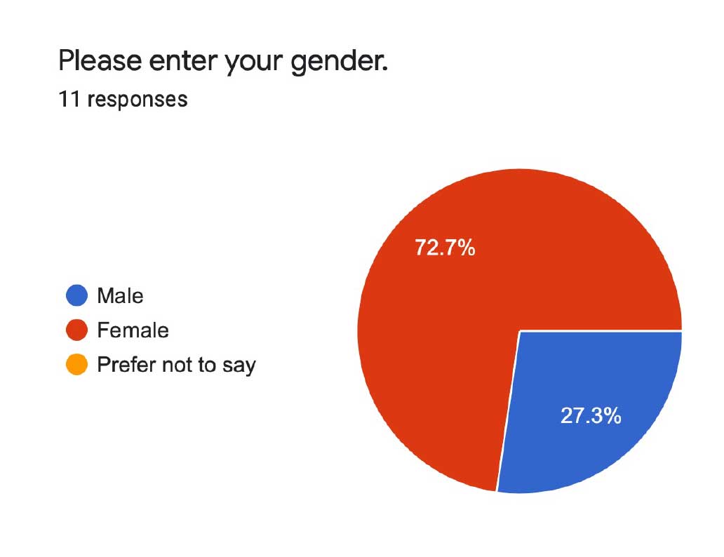
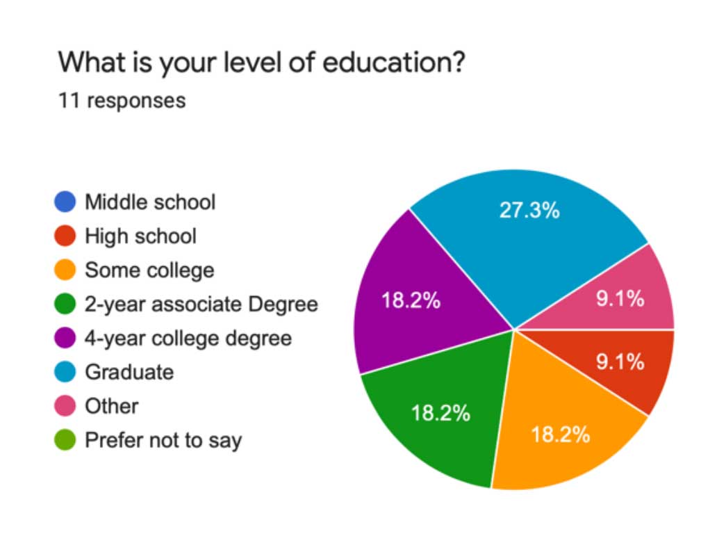
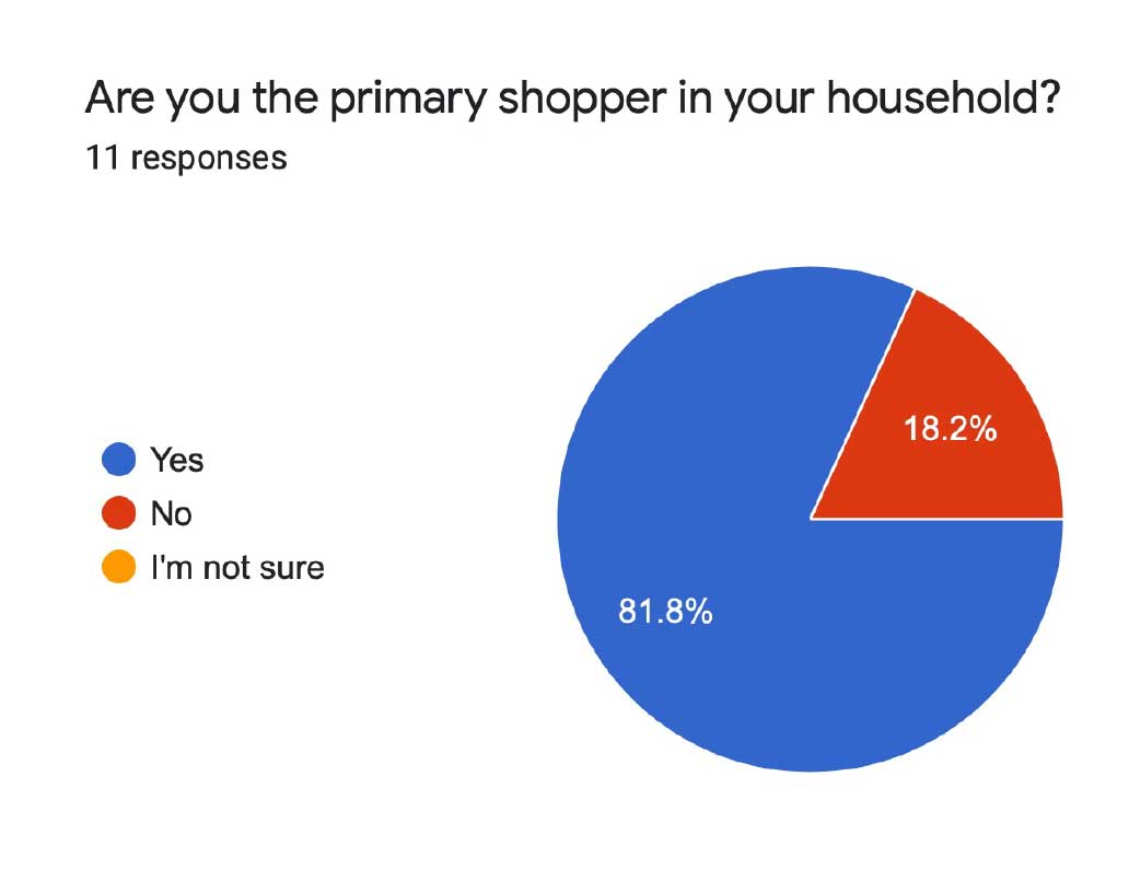
We created and conducted a survey using Google Forms to better understand the users needs and to gather information about user’s likes and dislikes when acquiring food for the household, and the likelihood of using a service such as Carrots.
We were able to collect results from 11 total participants. The target audience were primarily educated women who were in charge of household food acquisition, and aged between 27 and 65.
The key findings of the surveys were:
- Average audience household has 2 or more members.
- Majority of audience actively gardens at home.
- Majority of audience has the time to prepare their own meals.
- Majority of audience has expressed concern over food safety.
- Majority of audience has expressed a preference for healthy choices.
- Finally, nearly every respondent expressed concern for how environmentally friendly their food is.
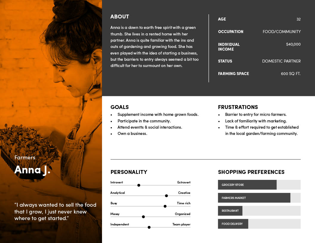
Persona Development.

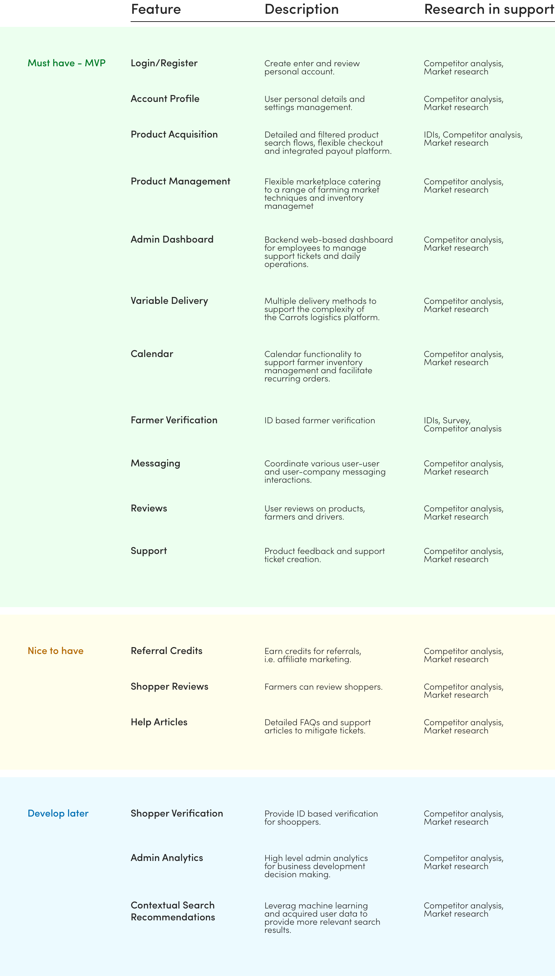
02. Define
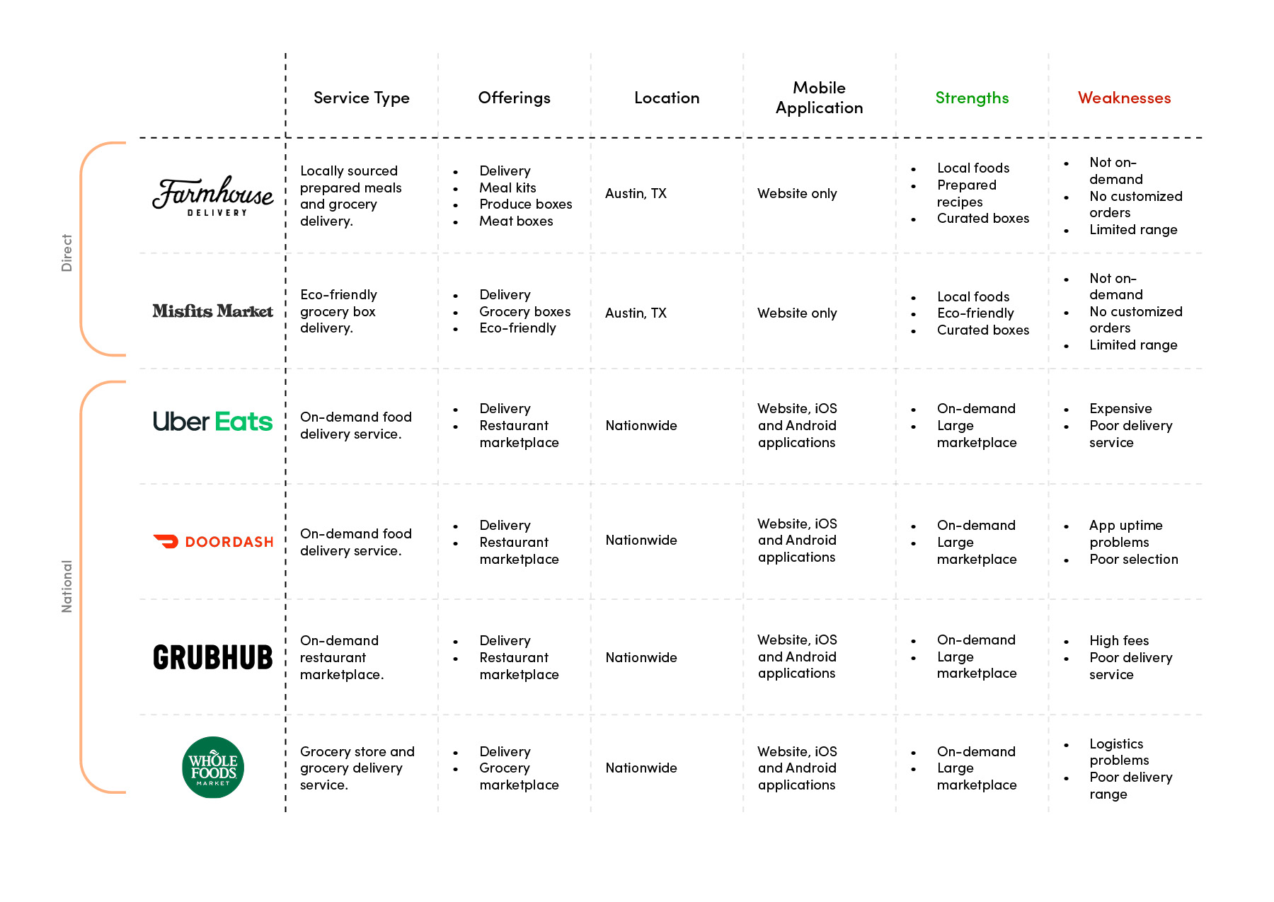
Project Strategy.
03. Ideate
Application IA Map.
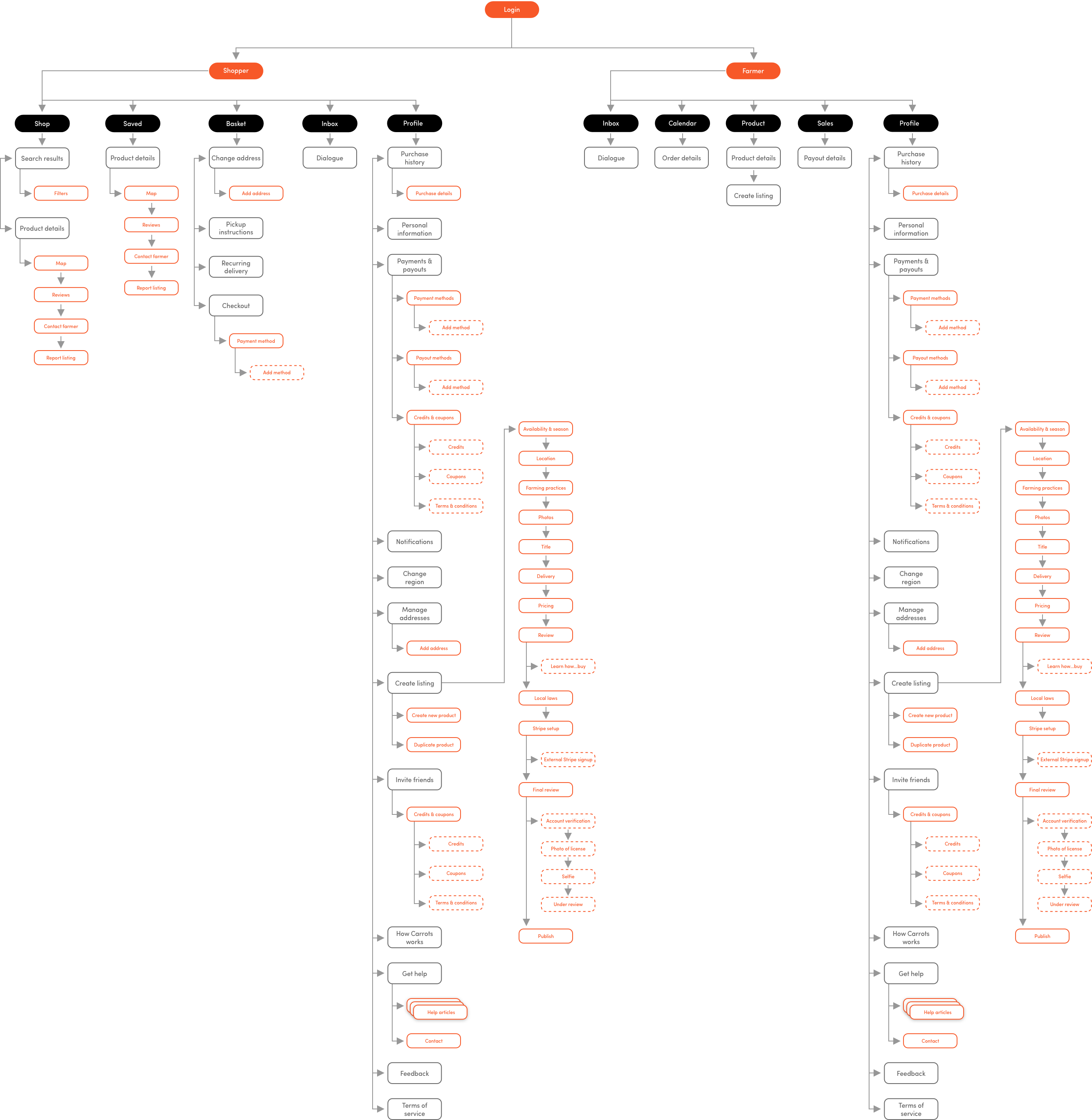
Interaction Design.
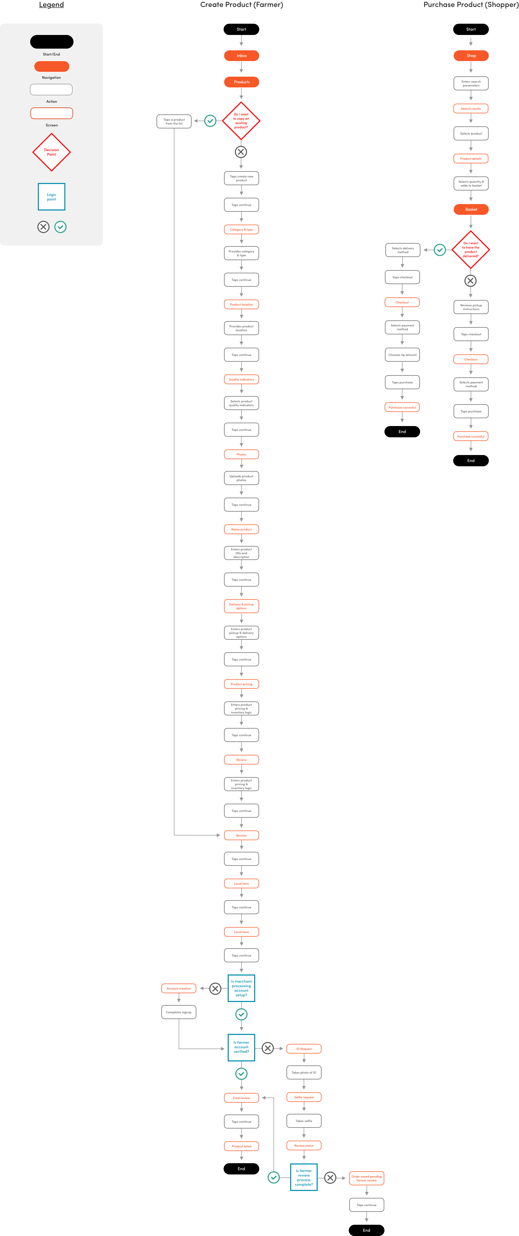
Before we started sketching and building out wireframes, we wanted to figure out what the user flows would look like for customers trying to accomplish specific tasks. The two tasks chosen would highlight the main feature functions that the app would provide for the user.
- Search for and purchase products.
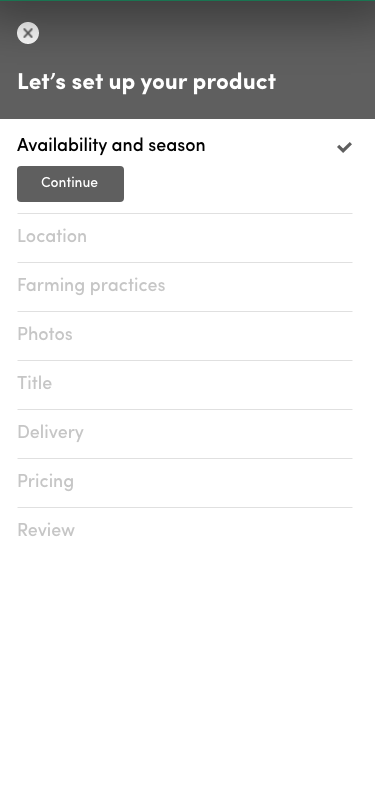
- List products and register as a farmer.
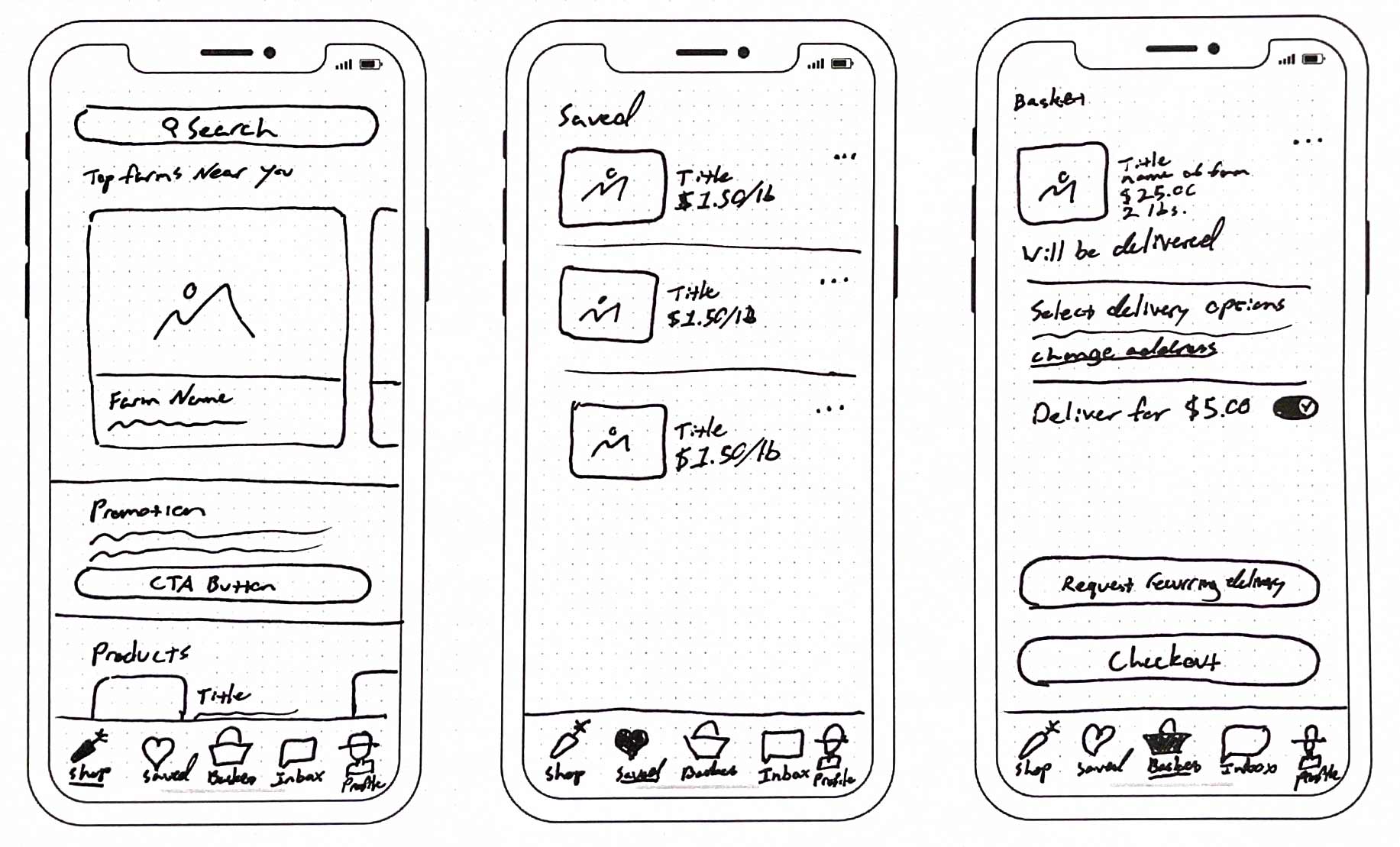
Sketching.
Low Fidelity Wireframes
04. Usability & Testing
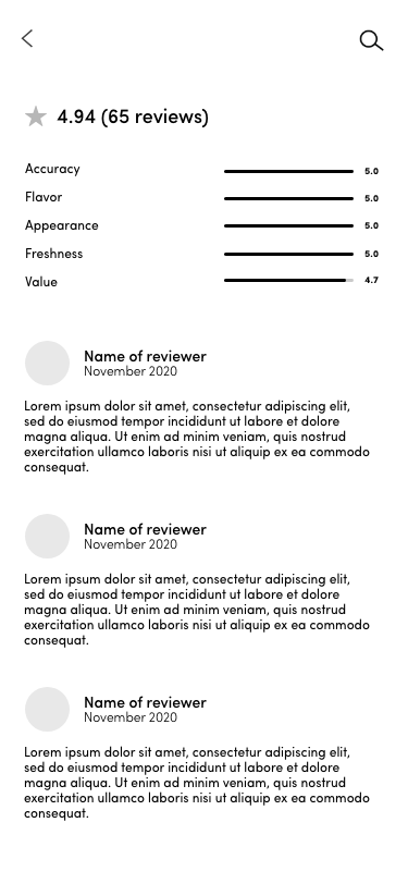
Usability Testing & Finding.
• A total of 7 participants completed this usability test.
• 3 out of 7 tests were conducted via Zoom interviews.
• 4 out of 7 were conducted via maze.
• Participants using Zoom spoke out their actions and thinking while completing the tasks given to them while we observed making sure we could assist at any point if needed.
• Participants were also asked to use the app freely via Maze and provide any feedback or recommendations. The unmoderated participants were asked to complete 3 tasks and provide feedback on their experience, what they thought of the interface, and how they would rate the ease of using the app prototype 1(Difficult)– 10(Effortless).
Key Findings.
Although many small signifier and affordance changes were identified and implemented, some key functionality was identified and integrated.
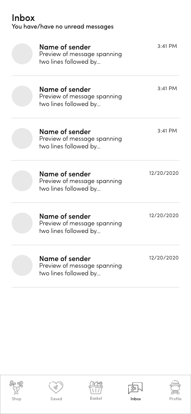
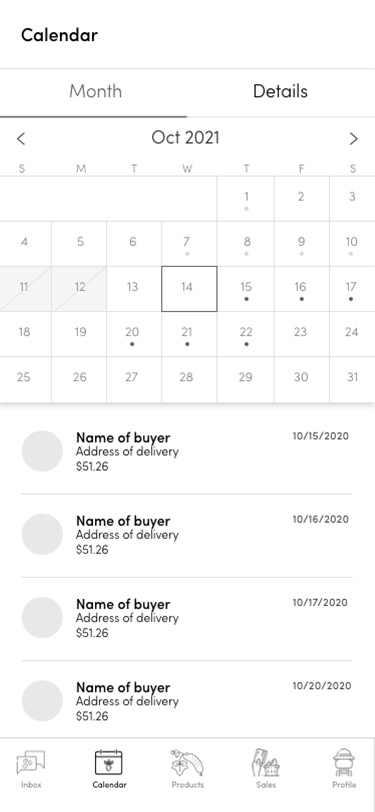
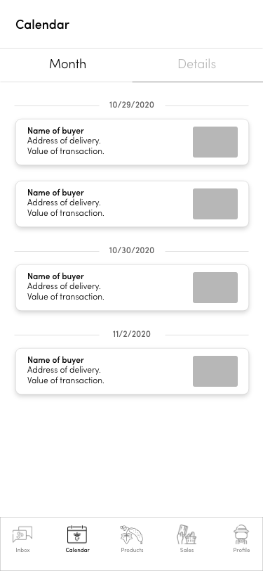
- Participants expressed some confusion with the Calendar functionality and desired a simplified interface.
- The users felt they would like to be able to leave a tip for the driver during the checkout process.
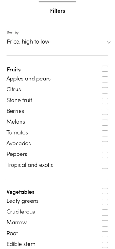
- Users expressed the desire to be able to filter search results between foods and farmers.
05. Brand
Fleshing out the brand identity.
Now that we had completed the user research and wireframing, it was time to add some flesh to the bones of our applications, dashboard and website. We began this phase of the project by returning to my personas and asking myself what would resonate most clearly with our audience.
we wanted to present a sense of refinement while also making the brand relatable and memorable. We decided to carry the minimalist elements of the wireframes through into the general branding while using consistent colors and imagery to provide a sense of cohesion.

Logo.
We had a general idea of where we wanted to go with this, but we also wanted to provide a range of options to the company. The ownership of the company is mixed male and female so it was interesting to have both genders providing their perspective for this project. The women tended to lean towards the more simplistic design (option 2), while the men leaned towards the more complex and bold designs (options 1 and 3). There was a consensus for the company to go with option 3. However, after consulting with some of the respondents to the interviews, we ultimately worked with the company to go with option 2, as this resonated more with the audience.
The key decision making factors were:
- Predominantly female audience.
- Respondents preferred simpler, more elegant design.
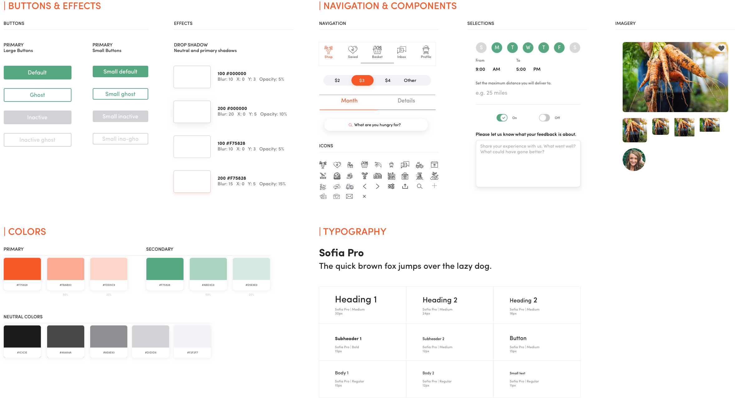
Typography, Colors & Imagery.
Having found firm ground with the logo and minimalist direction, we chose to use Sofia Pro as the font for the applications, website and admin dashboard. It has a clean, sophisticated and feminine essence while maintaining a superior legibility through a wide range of weights.
The chosen colors pay homage to the company's namesake while further softening the look and feel. We chose two primary colors, a muted earth tone green, balanced by an energetic and vibrant orange. Orange was chosen as the primary color due to its attention grabbing nature. These colors will be implemented throughout the various products with a continued aim towards minimalism.
With the colors defined, we licensed and curated a selection of photos for use throughout the company's products.
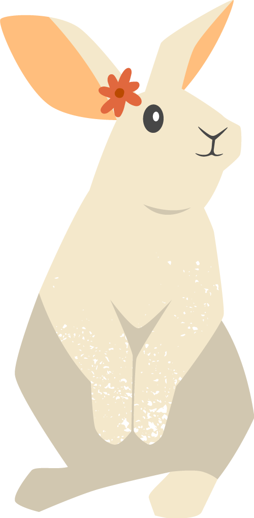
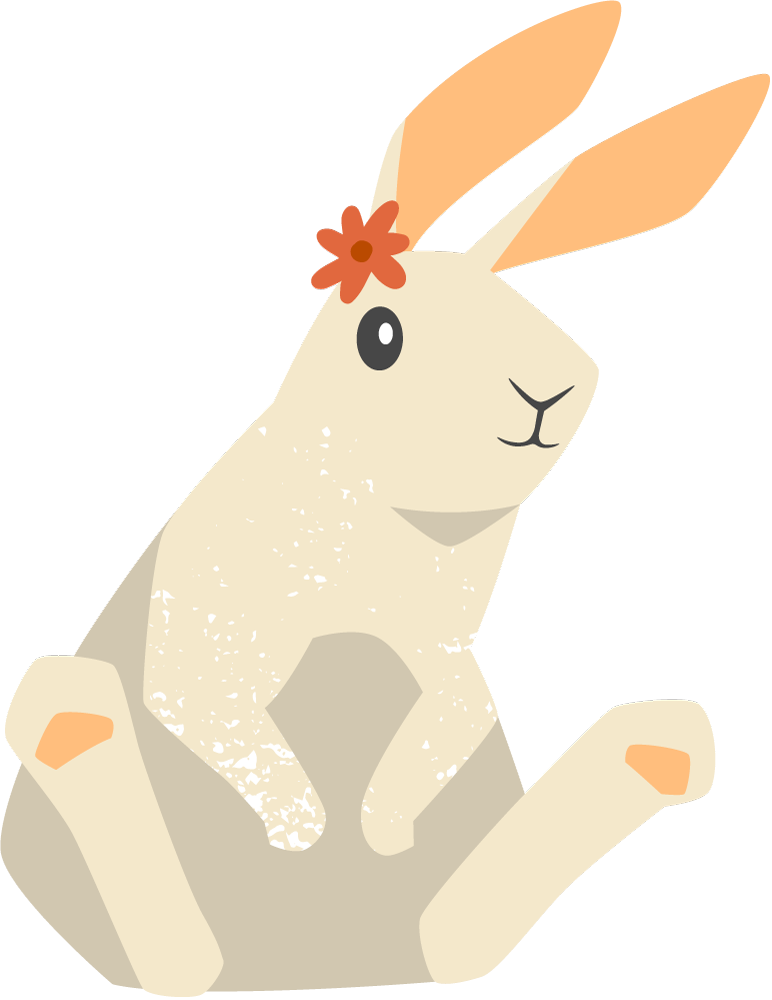
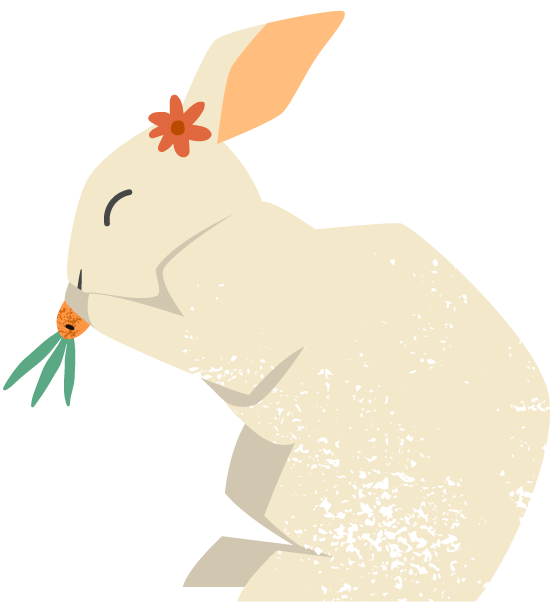
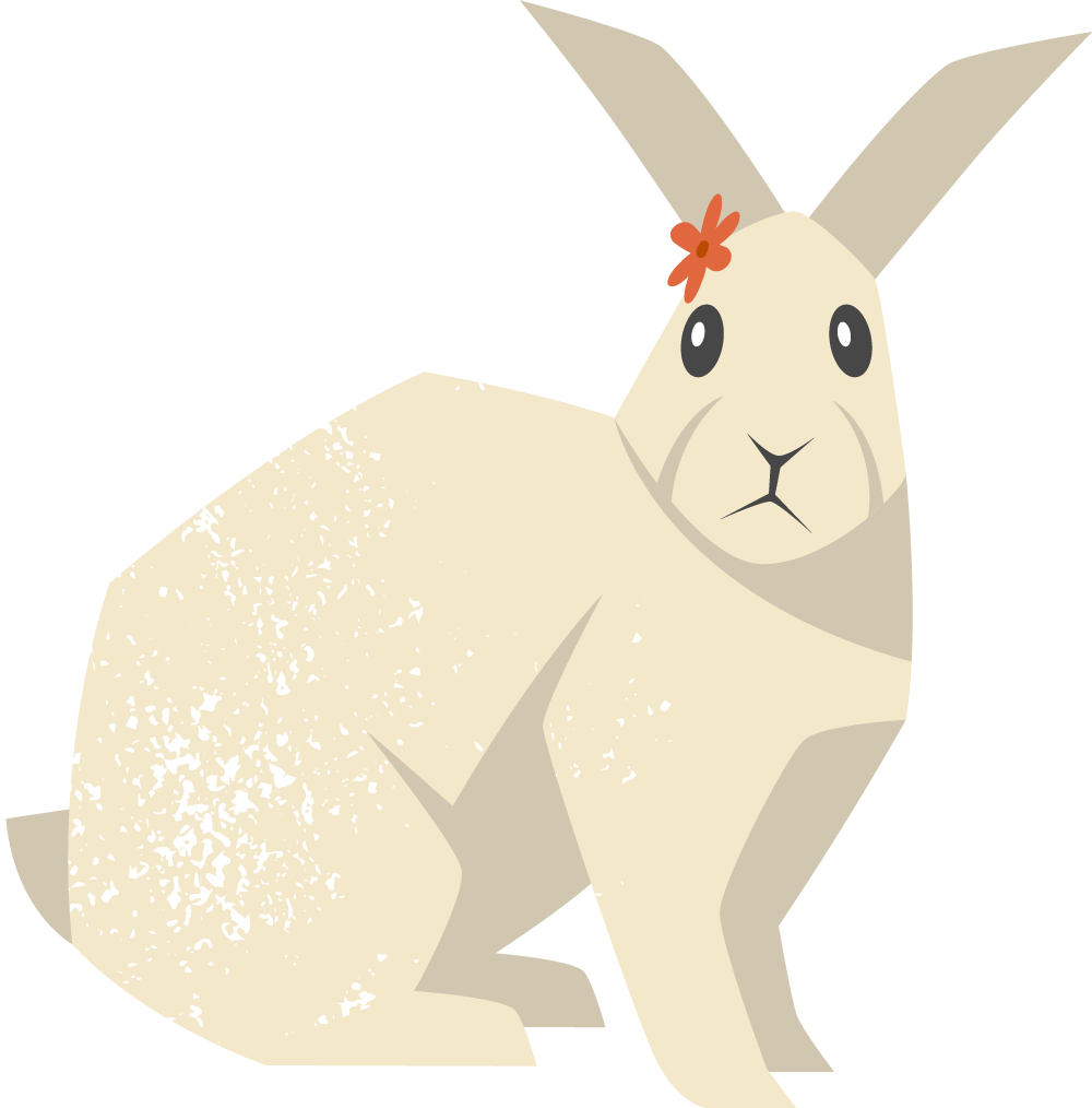
Mascot & Illustrations.
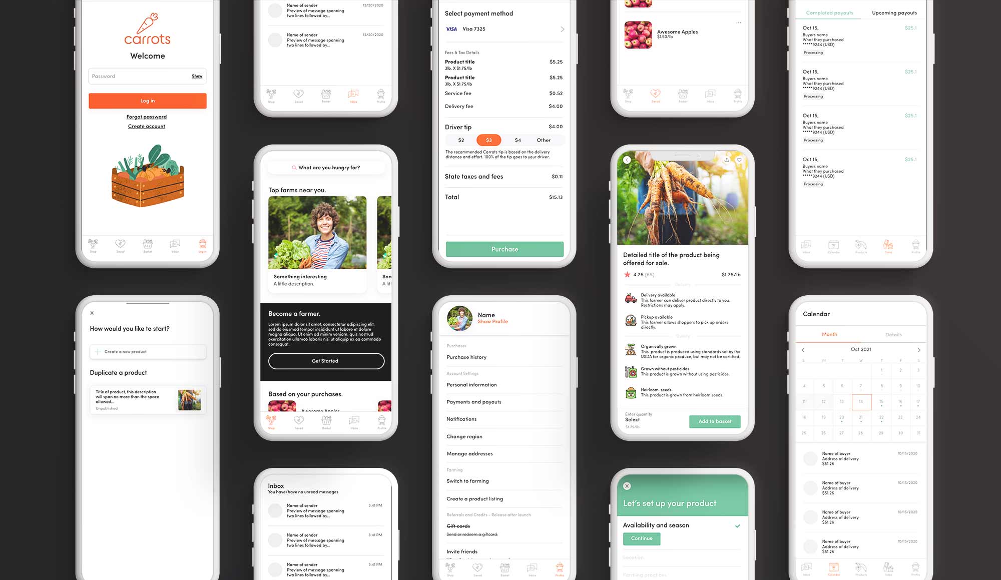
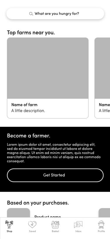
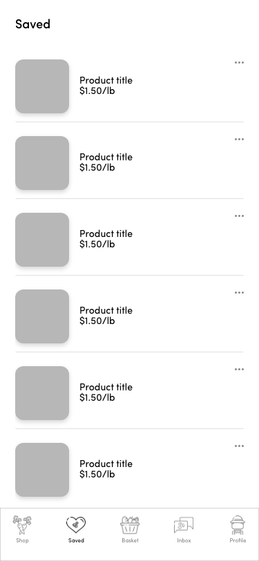
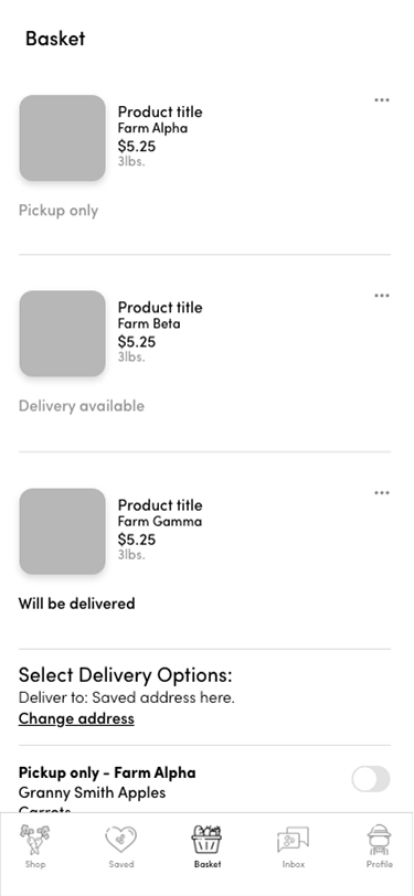
High Fidelity Wireframe.
06. Prototype

Next Steps.
Additional Deliverables for Carrots
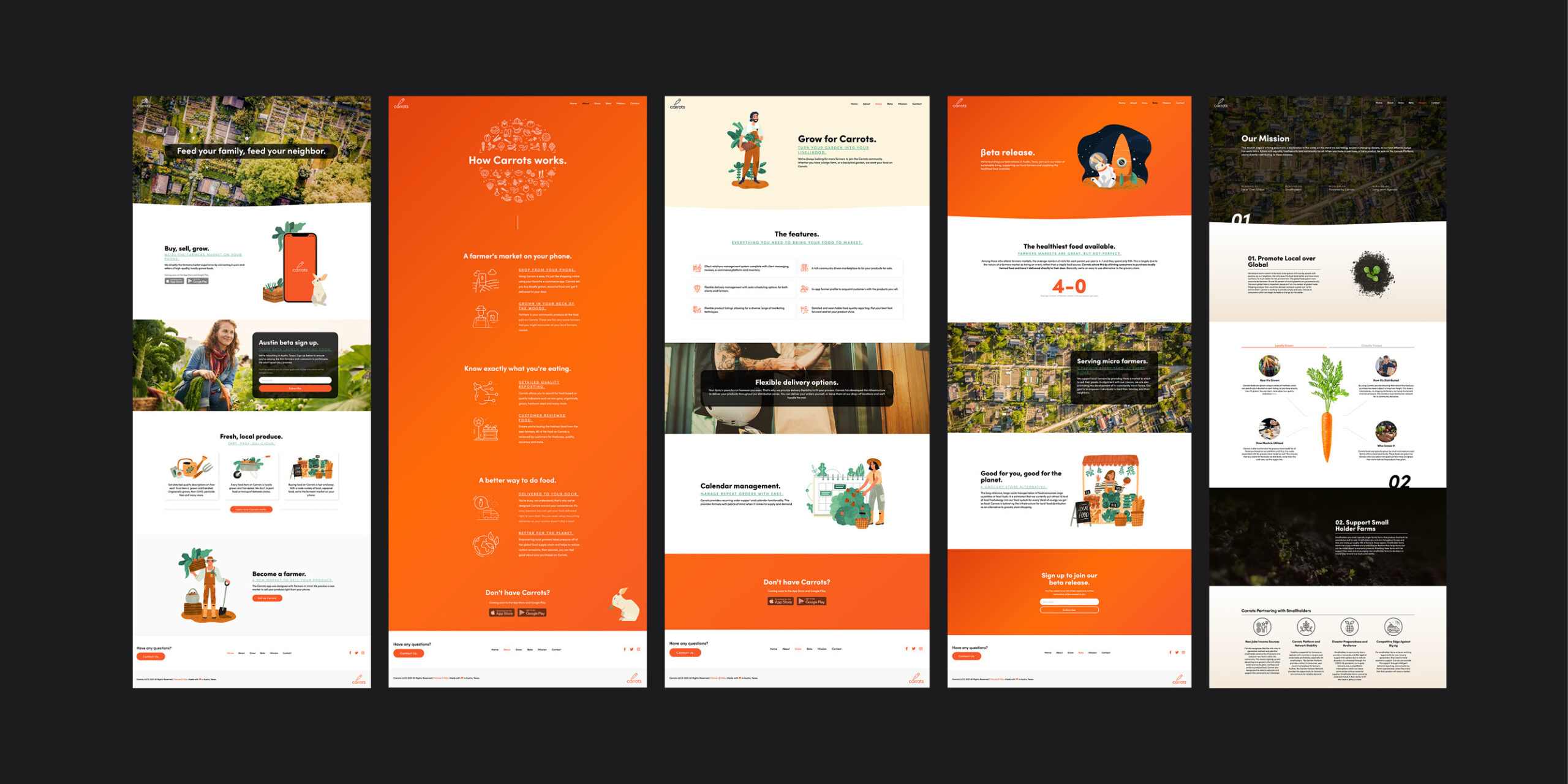
Customer Facing Website.